
Product Feature Design
I designed a “where to buy” feature within Instagram for a Boston SaaS company. Here’s the story.

More about Salsify
Salsify helps CPG brands “win the digital shelf.” Their PXM platform allows brands to upload and store all their data in one place consistently, and provide direct connections to push data to retailers, e-commerce brand sites, and social media.
Project Overview
UX/UI Designer (on a team of 3)
Contributions: Competitor Analysis, User Interviews, Secondary Research, Sketching, Mid-Fi Prototyping, Usability Testing, Presentation Design.
Tools: Sketch, Figma, Sharpie, Miro, Google Slides
Duration: 3-week sprint
The Experience
High Fidelity Demo
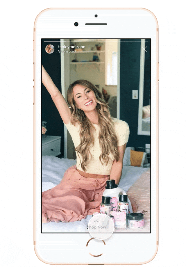
The scene…. You are scrolling Instagram and notice your favorite skin care Influencer with a new post, swipe up to shop now!
Hmm, do you want to buy online or nearby? Luckily moving back and forth between tabs is easy and intuitive.
Typing in your zip code, you instantly see delivery details. Normally you’d buy on Amazon Prime but you need fresh air. Get your lazy self to Target, it’s not that far... Here’s a link to set up in-store pickup at your favorite location!
How I Got There
The Opportunity
In collaboration with Salsify, we were given a greenfield opportunity to design a beautiful, brand new addition to their SaaS offerings.
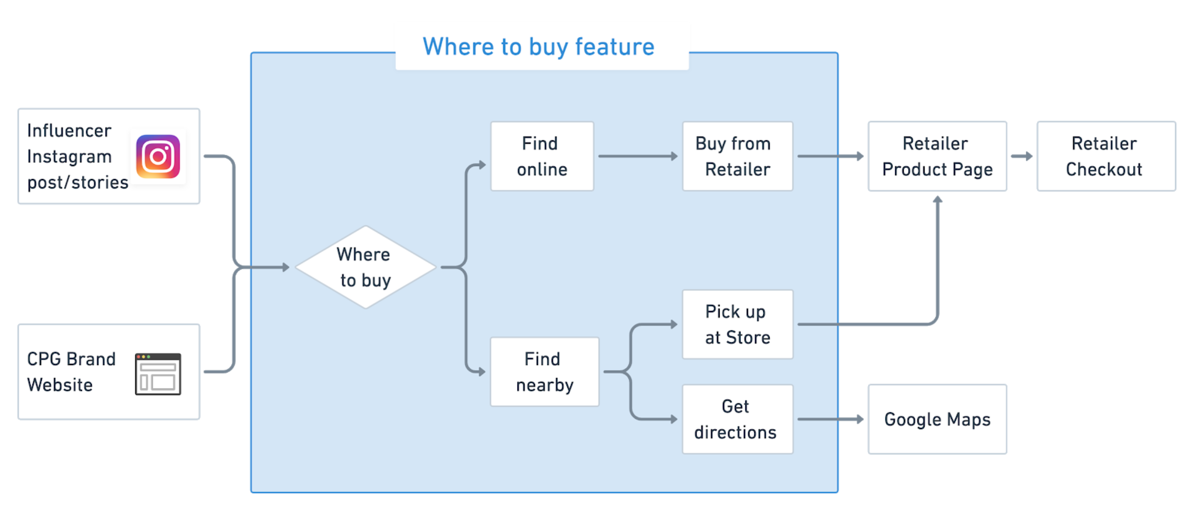
A “where to buy” feature allows users to find a route of purchase to consumer packaged goods on brand websites that don’t sell the actual product. Many CPG brands only sell via marketplaces like Walmart, Target, or Amazon.

DISCOVERY: User interviews
We interviewed 9 participants.
People who’ve been to a consumer packaged goods brand site in the last 6 months.
We collected data on:
What drives people to a CPG site?
How do people discover new products?
Which factors lead to their purchase decision?
How do they interact with CPG brands via social media?
Discovery
Affinity Mapping
To find patterns and learn from our data we created an affinity map; the most interesting research related to social media and product recommendations. Participants enjoy receiving product recommendations from friends, blogs, even podcasts! Those recommendations frequently lead to a purchase.
Everyone participated in affinity mapping.
Insights
Searching Google to find the cheapest price.
Users want to buy in store depending on the product.
Wishing for an easier alternative to Amazon.
The values of a brand are important.

I conducted the secondary research.
DISCOVERY: Secondary research
The influencer industry is forecast to be worth $10 billion in 2020.
Wait.. you mean the fashion industry tapping this jackpot but not consumer packaged goods brands? Hmmm…
Influencers seen as authentic and have large loyal networks of people who engage with them. In recent years this has become more effective than traditional advertising. Consumers trust recommendations from a third party more often than a brand itself. (I did this research.)
Stakeholder Check-in
Salsify was extremely interested in Instagram shopping. With our findings demonstrating the power of word-of-mouth recommendations, we decided to leverage the success of Instagram influencer advertising and design a feature to drive CPG brand sales.
Reframing The Problem
Users need an efficient way to purchase products based on recommendations and to ensure they are accessing the best way to buy from brands that sell via retailers, like Amazon or Walmart.
Salsify’s clients are currently using “Where to buy” features from competitors such as PriceSpider, because they don’t offer a similar solution.
The Solution
By creating an easy path from an influencer recommendation to retailers, we can help users compare and choose, buying the products they want where they want.
We will know this to be successful when product sales increase, and users engage with the “where to buy” page.
DEFINE
The Happy User Journey
Users get product recommendations from an Instagram story and swipe up to “shop now.” They can see every buying option available online or nearby. They have the flexibility to evaluate, pick a retailer, and will be directed right to the product page on the retailer site to continue their purchase journey.

Visual designed as a team
User Flow
The user can start from either Instagram or a CPG brand website. Our “where to buy” solution guides the user to easily compare in-store and online purchase options. They are then taken directly from the feature to their purchase destination.
Visual designed by team member
ideation
Sketching
As a team we sketched a mobile first interface allowing users the choice of purchasing a product in-store or online. We used our research to make assumptions on what users needed on each screen of the interface.
ONLINE
In-stock
Price
Estimated time of delivery
Delivery cost
IN STORE
Store address
Distance
Store hours
In-store pick up
In-stock

Usability Testing
Guerrilla Usability Testing
With Experiential Marketing as my side gig (for 8 years), I am comfortable talking to anyone about anything. I’ve found this makes for GREAT usability testing.
We rapidly tested with 3 users and iterated on our paper prototype. This was key in understanding what information was pertinent to users at each touch-point in their journey.
Users cared most about: Best price, seeing retailers they like, delivery time, and and having a localized experience.
Paper prototype test: 3 participants
Mid-fi prototype test: 5 participants
Hi-fi prototype test: 4 more participants
Usability Results
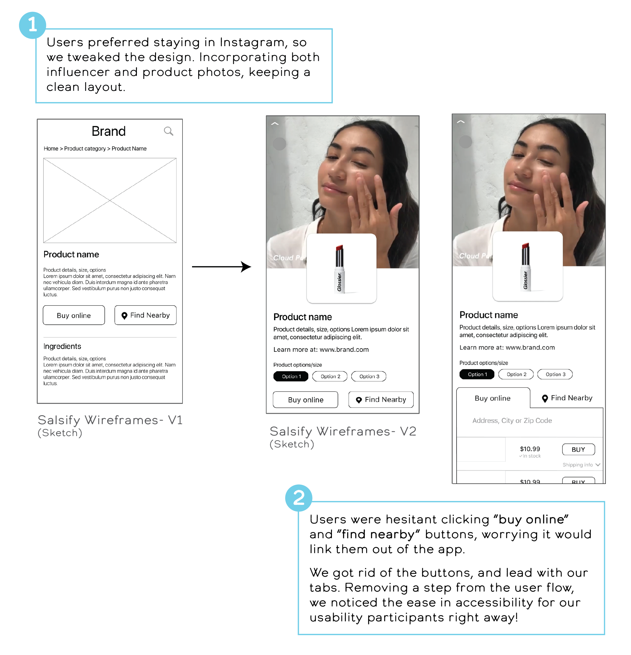
Tabs were helpful and intuitive structurally
Most participants didn’t need extended product information, so we included a link out to the brand site.
Some Users tapped on the retailer logo, expecting an action
We made the whole card a button
And changed verbiage for a clearer CTA
Some care about price, some were loyal to specific retailers
Iterations
Mid-Fi Wireframes
After deciding on the layout and the necessary elements, a teammate and I designed wireframes, adding simple imagery to get a better sense of how our screens would look.
Visual Design
Versatile Modular Layouts
We each took a brand into high fidelity applying insights from usability testing. With our combined ideas and UI best pattern practices, we settled on a main design.
Creating a versatile modular layout allows Salsify’s CPG brand clients to customize colors and fonts according to their brand’s aesthetic.
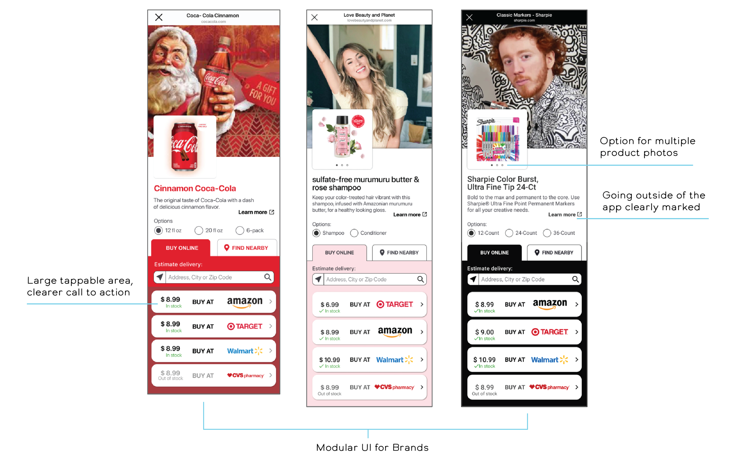
Santa as an influencer? C’mon.. that’s funny! (my prototype)
High Fidelity Screens
PRESENTATION
Deck Design (me)
I formatted our research, process, and solutions into a 23 page deck, which we presented to stakeholders as a team. Below are a few highlights.

3 Things I learned
People’s habits fascinate me.
Stepping up as “Task Wrangler” helped us move forward, even if it felt harsh at times. (Rabbit holes are no joke..)
Encouraging each other to explore all ideas and angles, makes for a great team.