Startup Design System
I collaborated with startup Demand Analytics on a data visualization-heavy design system to support their new UI.

Project Overview
My Role: UI Designer (working w/ 1 Lead UX Designer)
Contributions: Design System, High-Fidelity mockups, UI elements.
Tools: Figma, Jira
Duration: March 2021 - May 2021
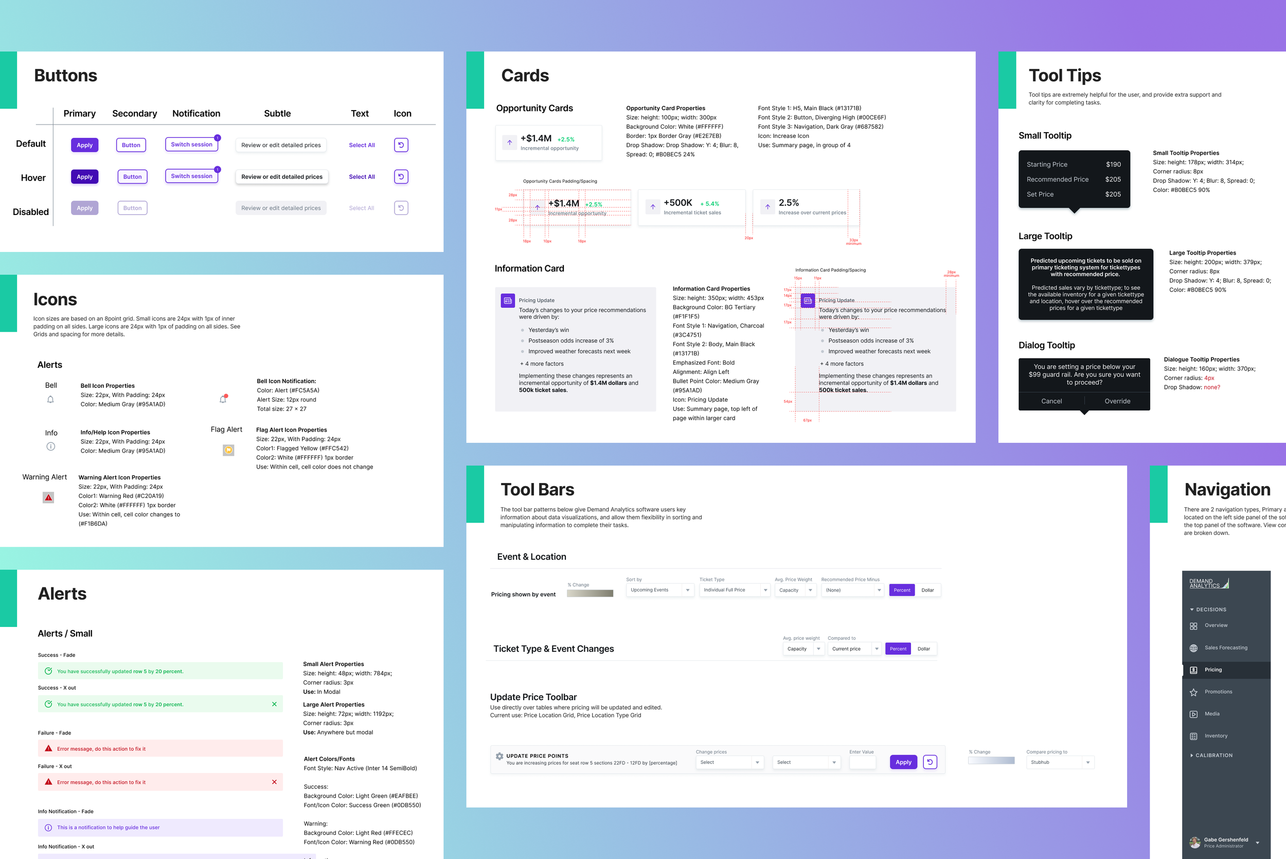
Final Design System Preview
Overview
Demand Analytics is an AI Enterprise software platform for internal analytics teams in the MLB and NFL. The software’s Machine Learning model predicts prices and attendance for games, allowing the teams to make smarter decisions with ticket pricing, staffing stadiums, and more.
With help from their UI mockups, I built their entire design system to support growth and the newest development release deadlines on their roadmap.
Users
Experts in analytics and range from Analysts, to Executives.
My Process
Discovery
Stakeholder Interview
Problems found during my initial UX audit:
Type scale and color palette were inaccurate
Too many grays not accounted for in the design
Color contrast in some areas flagged (poor accessibility)
Challenges Identified:
Data viz heavy- It was extra tricky to break down components. I looked at components from an atomic perspective and rebuilt them following the improved design system.
Users are experts in analytics, (and I was not). With a steep learning curve, I needed a lot of back and forth with DA for domain expertise. It was crucial to keep very open communication and I was quick to admit when I didn’t understand something. The client helped solve this by providing video walkthroughs and impromptu Zoom calls to walk through user flow scenarios and give ideas about the user’s perspective.

Research
Inspiration from Google’s Material Design
I broke the system down into the following sections:
Intro Page
Branding
Components
Grids & Spacing
Ideate
Proposed Design System Solution:
Audit and cleanup UI, then build the design system.
Add light specs & HTML snippets to guide the Engineers, create team transparency, and give tools for quick reference and a fast build.
Interaction laws- original design system buttons lacked states. Giving proper feedback to users also was a crucial step in accessibility.
Find a new Sequential color palette for data, (theirs was mucky brown-green, yuckkk).
The client loved my proposal! So let’s get started.
Prototype
Building the Design System
Color Styles:
Simplified the color palette; from 15 grays to 9!
Created a section for Data Visualization colors including their scales.
Notated where colors were used to help the Engineers learn the new branding quickly.

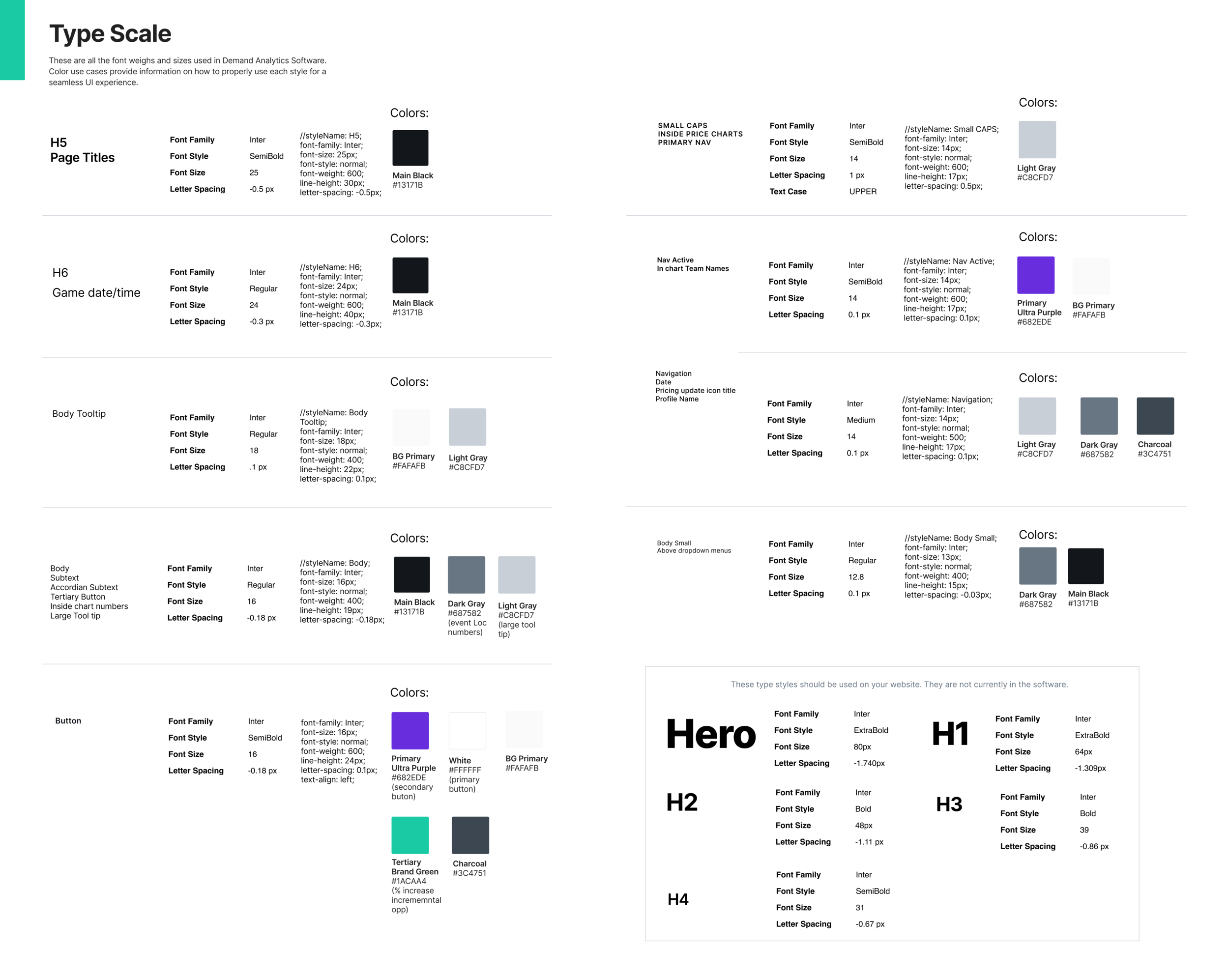
Type Scale: Their old type scale didn’t match the interface.
Redesigned the type scale to match the actual UI, and adjusted the mockups when I found inconsistencies.
Renamed all typestyles and notated where they are used.
HTML snippets included
Added all the colors each font style is used in, as requested by stakeholders.
Object Styles:
Simplified and named elevation styles and wrote HTML snippets.
Simplified corner radius, updating UI as needed.
Defined stroke weights and provided tips on where they are used.

Components:
Since the component section is large I chose to break down a couple of small stories and how I worked through them. The full list of everything I designed is below.
Buttons (New states and interactions)
Icons (created consistency and new rules)
Form Elements (New)
Navigation (increased typography contrast for better readability)
Cards
Alerts (New)
Data Grid and Table Elements (New and Complex!)
Tooltips
Users
Tool Bars (1 new)
Type Pairings
Accordion menus
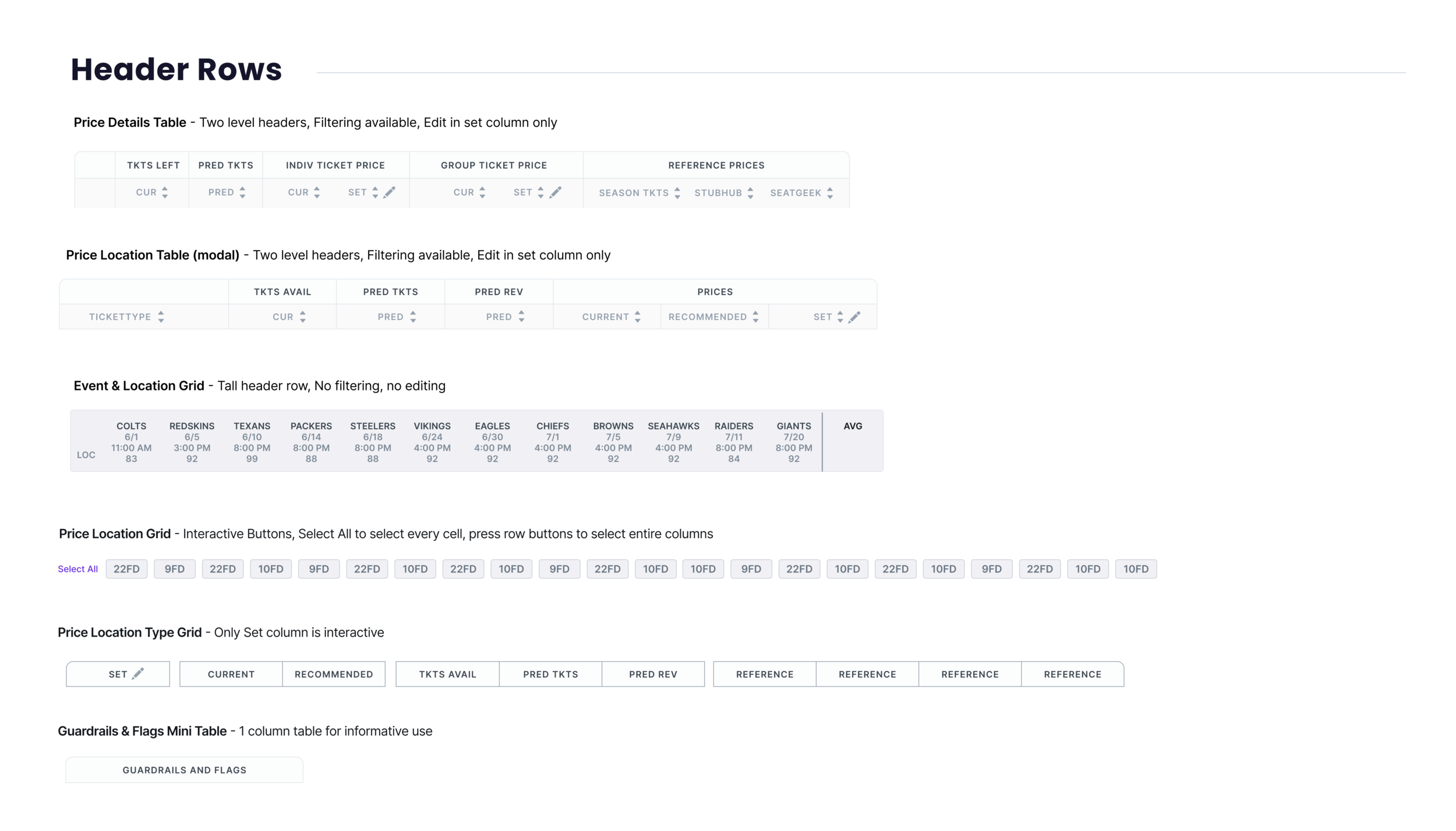
Data Grid and Table Elements
Demand Analytics had a lot of complex data visuals to break down. After speaking to the Engineers and carving out a plan, I spent the bulk of my time specifically on tables and grids.
Based on Engineer feedback I created 2 sections:
The Data Grids section shows each grid or table with its specs and properties. This is to help the Engineers properly construct tables and grids from a cellular level.

The Table and Grid Elements section functions as a pattern library. Here i show the cell states, header rows, and rows.
This library creates high-level overviews of current states which may be modified over time.


ITERATE
Design systems are never done
I worked back and forth with Stakeholders and Engineers to get the design system ready to deliver.
Stakeholders made comments/changes via Jira and tagged us Designers in Figma for improvements and edits.
The design system foundation I built is crucial for the growth of this small startup’s platform.
Project Learnings
Be honest if you don’t understand, it’s ok not to understand. Being very upfront and honest with the client and asking for further explanation is great, and they appreciate your eagerness to understand.
Make sure the Engineers have a voice early on.
Use the best practices and resources available.