
Product Design
We designed a platform for frontline healthcare workers to receive “thank yous” from the community. Here’s the story.

More about Medi+thanks
Covid-19 has left frontline medical workers feeling the most stressed, worn out, and unappreciated of their careers. Medi+thanks gives the community an avenue to express their gratitude.
Press- Interview:
Project Overview
UX/UI Designer (on a team of 6) Other members include 1 UX Researcher/Designer and 4 Software Engineers.
Contributions: Secondary Research, Design System, Mid-Fi Prototyping, Usability Testing, High Fidelity Prototype, Logo, and Name.
Tools: Figma, Miro, Hand-off to React
Duration: 3-day hackathon (winner!)
The SUMMARY
Long Story Short
Our team empathized that frontline health workers are under intense pressure and exhaustion due to the pandemic. Based on user research we found the community WANTS to give support. We addressed the problem with a user-centered approach and design thinking.
Our Solution:
Medi+thanks is a web app allowing the community to post virtual “thank yous”. This wall of gratitude will be available for any healthcare worker who needs a boost (via mobile, desktop, or tablet).
The application was designed, tested, and launched in 3 days to full functionality using React. Its V2 roadmap is in the works.
Live Web App: https://medithanks.com

Home/Feed
Add Post
How we Got There
Hackathon Met Goals
Worked collaboratively with a new team under a tight deadline.
Led Product Design and UX wireframes to final prototype development
Handed off quality assets to Engineering
Built an innovative application
Won 1st place
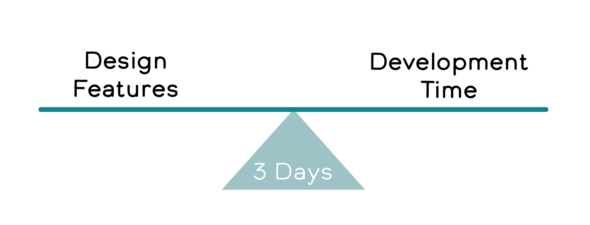
Designing realistically to Develop
With only 3 days, we worked closely with the engineers to plan efficiently within the short time frame. We identified must-haves vs stretch goals.
Devs started with CRUD- Create, Read, Update, and Delete. Designers dove into branding, user surveys, and wireframes.
1. DISCOVER: User RESEARCH
We surveyed 14 participants.

Key Takeaways:
64% have expressed appreciation to frontline health workers
89% say thanks in person
44% via social media
22% Shared support with signs in their yard or window
If you could thank a healthcare worker, what would you say?
“I have thanked them for their committed service to help everyone in need. I thanked them for showing compassion and selflessness to the community.”
Gratitude for frontline healthcare workers is from a wide range of care.

Health care workers are experiencing…

Only 35% feel they have adequate emotional support.
😢Source: https://mhanational.org/mental-health-healthcare-workers-covid-19
The Problem
Frontline health workers are experiencing unprecedented hardship from Covid-19.
How might we support them and show gratitude?
The Solution
A web app for frontline medical workers to receive appreciation for their work through a digital wall of 'thank you’ notes.
2. Define
The MVP
Key features:
Public to view the feed, sign up to post
Posting
Optional to be anonymous
Tag city & hospital
Responsive design
Minimalist profile page
View # of posts
Edit/delete posts
V2
Stretch Goals:
Posting
Emoji keyboard + Color Picker
UI Feedback after posting
Post Reactions (liking of other posts in feed)

User Flow
We aimed to make our user flow simple.
Goal: Users of all ages and tech proficiency can understand

3. ideate
Forming a Product
A simple name was needed, and it took a lot of brainstorming to get there. For the color palette, we focused on friendly shades of teal to mimmick hospital scrubs.
Responsive UI
Based on Material UI grid systems
Looked at 3 screen sizes (S, M, L)
Focused on clean design with easy to use simple MVP features.
— We focused on desktop first with mobile as the preferred browsing platform for the frontline workers.
Design System

Grayscale Wireframe


4. Prototype
Let’s break down the elements that create this experience.
A. Card Hierarchy

B. Easy Sign Up / Log In

C. “Thank You” Post Anatomy

5. TEST
3 Usability Testing Results
Key Findings:
2 users found creating a post button hard to find
We learned to be consistent with our wording; “message” or “post” or “thanks”
The use of a hero message gave users context
All users wanted to be able to add emojis, and change color and fonts.
Iterate
High Fidelity Changes
Based on testing we made a few slight changes.
What I learned
Making sacrifices to the scope early on helped us keep on track for development.
There are no stupid questions. Designers can only learn what is easy or hard to code if we ask; it’s a continuous effort I make as a Designer.
Communicate with Devs early and often. Even the quick check-ins I made for them to show me their work helped identify design errors and correct responsive behavior. We moved forward efficiently with all questions answered.