

Turning Customer Centric - trender.ai

TL;dr We transformed a channel-centric platform into a CRM-like format, reducing in-app time by 50%.
Context
Background
Trender.ai began as a social listening tool for marketers. In December 2023 trender which once held several channels in a feed-like social media format was getting overcrowded.
After a pivot to sales intelligence, the software needed a streamlined redesign to support the new core workflow user experiences.
This redesign was part of a product growth initiative.
Business Goal
I collaborated with stakeholders, utilizing their industry knowledge along with usability testing results in my design process. I was in charge of redesigning the new entry way into the app, with only a week to design and fast hand-off while finishing up the final touches.
The redesign went live January 2024 👇
My Role
Before: Early 2023
Channel Driven Home: Supports channels of prospects and topics.
After: Jan 2024
CRM Style Home: Fast value
Project Overview
My role: End-end Product Designer
My Team: UX Research by VP of Product, 1 FE Engineer, 2 BE Engineers
Duration: December 6 - 15, 2023
Deliverables: High fidelity design
❌ Don’t make me work… to find what i need
Users had to scroll often through large lists to find an exact name and that led to frustration. Grrrrr 😡
Menu Issues:
Find-ability was bad UX
Bulk action functionality unavailable
New channels sometimes added out of order
Frequently we heard from users
“I love the concept but what do I do from here?”
“I can’t find the profile I just set up, on LinkedIn it says it went through.”
Old Left Menu: Profile section of trender.ai
👉 CONSIDER OUR CONTENT
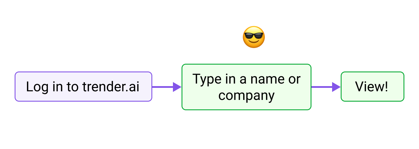
Users need a fast route to find a name or company.
There are two types of “records” in trender.
Watches - monitored social feed (LinkedIn & Twitter)
Profiles - AI insights, social & web, AI icebreakers for outreach.
For Competitive research I gained design inspiration from Outreach and Hubspot! The two prominent sales tech tools which are the most popular amongst our user base. (They also have the prettiest tables I’ve seen 😍.)

Outreach

HubSpot
❌ out with the old
Removing friction: no more scrolling to look for prospect records. (see below)

✅ IN with the new!
Usability and speed updates. Sales reps can now find a prospect in seconds! (see below)
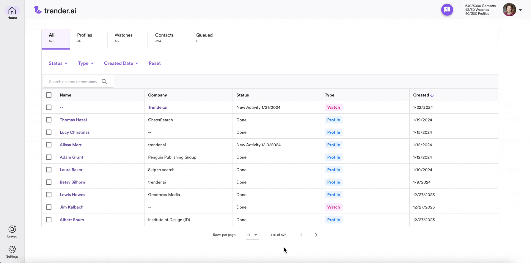
The “CRM-like” solution allows…
Type and search names
Sort records in real time
View records with new activity at the top
Complete bulk actions
Filter views
CRM Style for the win!
🙌 Redesign Result:
This feature was a huge success. The CRM-like format held names and companies, allowing for clear organization and discoverability.
(*scroll down for more of my process)
full control = Better usability

Each prospect is searchable.

Bulk actions complete control at speed
Tabs full viewing control

Status visibility on new and recently completed.
Type how the record is classified.
MY Process:
Quick sketches helped me organize the content and decide on column headers.
Then I moved into mid-fi designs in Figma. I snagged a beautiful table component I previously designed from our design system!
get the beginning design in front of my PM asap
During my call with my PM, she pulled up HubSpot and showed me pre-formatted tab views on the table. ✅ Added to the requirements!
Other design additives to help our users were inspired by CRMs.
Search bar
Sort by columns
Filters: Date created w/ date picker, type of record, and Activity (to show records with new content at the top).
Color coded tags for our record types; Watch & Profile
ONTO HI-FI FAST AS FLASH
I created a high fidelity comp in Figma, got it approved, and rapidly designed the rest of the screens.
Adding specific interaction design notes for development 👉.
After the design was set up I took a catalog of what was left in the app that might need an information architecture reboot.
Sketching for speed (not for beauty)

Shot of my dev notes and labeling for hand-off
Final Design revisions
Changed “New Activity” column to “Status” which will show new activity, and processing or queued info.
Queue icons were added so users can see status at a glance.
Removed old nav links for Profile and Watch channels.
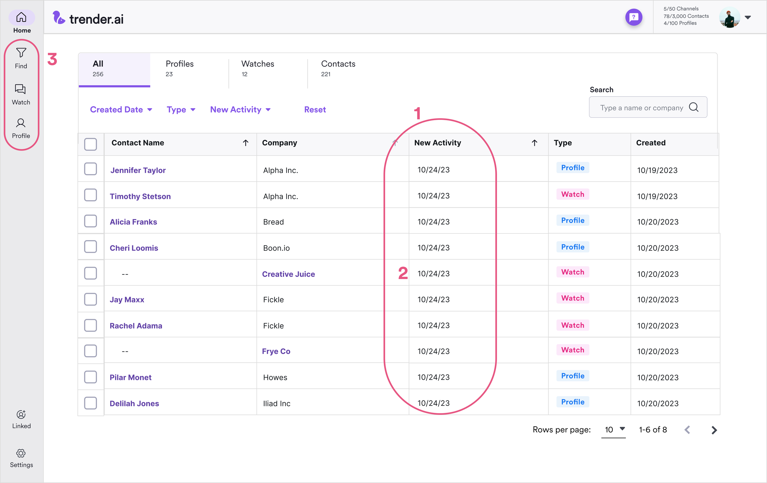
Home page areas modified shown in red.
Supportive empty states were added

Modified home page

Usability update: X to clear search result field.
In Reflection
Why reinvent the wheel? Almost every sales app uses a table structure to manage data records. This structure and IA is a strong force and not something we should innovate on.
Making the app faster to use sounds easier than it actually is.
Next Steps
With an increasing learning curve, in-app resources are key!
A Resources landing page in-app will help new users, and help current users become experts.