
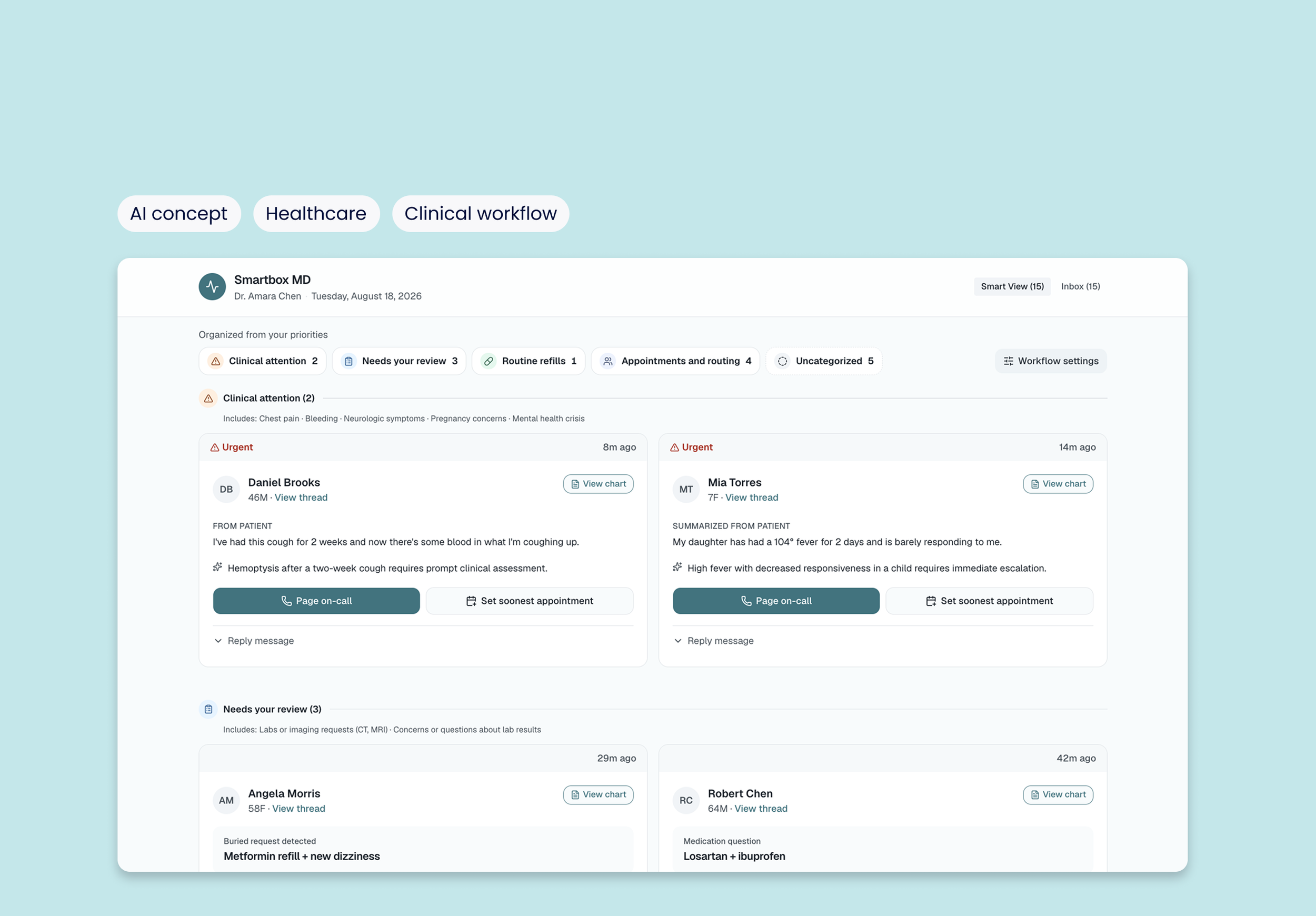
Designing a trustworthy AI workflow for clinical inboxes
TL;dr I designed an AI-assisted workflow to help clinicians triage patient-portal messages according to their own priorities—reducing manual sorting while keeping clinicians in control.
Role
Product Designer
Scope
Academic healthcare UX capstone
(not shipped)
Team
Solo
(Professor + peer feedback)
Methods:
Secondary research
Social listening
Workflow design
Survey research
feature prioritization
The Problem
Patient portal messaging increased by more than 150% since 2020, contributing to growing clinician inbox burden.
- Source: Trends in Patient Portal Messages, Office Visits, and Telephone Encounters, JAMA 2026

Every message forces 3 manual decisions:
What needs urgent attention?
Who should handle it?
Does it need an appointment?
For some clinicians, this work also extends beyond scheduled clinical hours.
The design opportunity: Reduce repetitive triage work while preserving the clinician’s ability to review, override, and control how messages are handled.
Proposed solution
Smartbox MD
A configurable AI-assisted workflow for managing patient-portal messages.
Instead of imposing a single triage system, it adapts to each clinician’s stated preferences.
Captures preferences for urgency, routing, and delegation.
Organizes incoming messages according to those preferences
Recommends next steps while keeping clinicians in control
Surfaces relevant context before a clinician opens the full thread
Design goal: less repetitive triage, more "this actually works the way I do."
design considerations
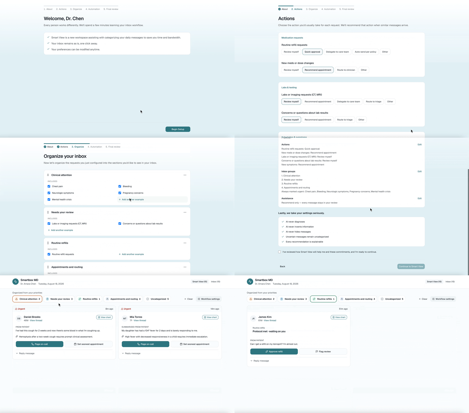
I designed for trust through three forms of control:
Configure — Define how recurring requests should be handled.
Choose — Set an automation level that matches your comfort.
Revert — Switch back to the standard inbox at any time.
My process
Social listening on Reddit revealed common patterns
“Way too much access, too many non-urgent messages flagged as urgent… Time suck, time waste, and distracts from taking care of the patient in front of you.”
— Anonymous Reddit user
hypothesis
I hypothesized that AI-assisted prioritization could reduce the cognitive effort required to manage clinical inboxes.
concept evolution
Here’s how my design ideas evolved through iteration while learning more about users, their AI comfort level, and other innovations in Clinical AI SaaS.
Inbox synthesis → separate views → workflow personalization.
V1 Inbox redesign: Surface message context
Priority labels and summaries brought more signal into the existing inbox.
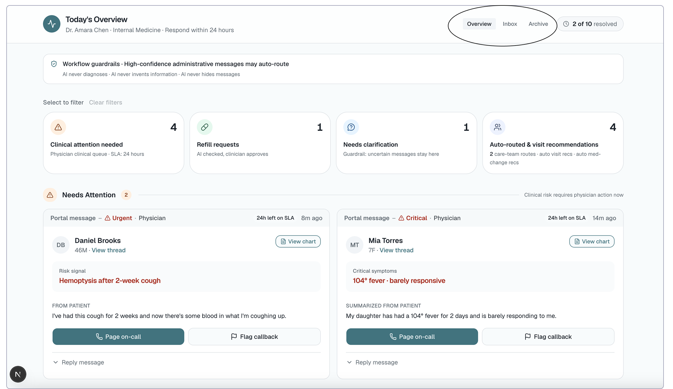
V2 Multiple views: AI as an additional inbox layer.
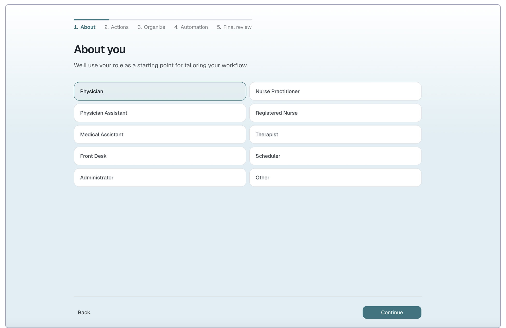
V3 Workflow personalization:
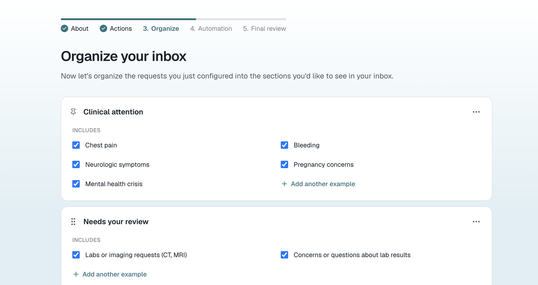
Let clinicians define how different requests should be handled (during onboarding).
product ecosystem
A white-label AI assistance layer concept for existing clinical messaging systems
The proposed solution could integrate with an organization's existing patient messaging system and augment workflows.
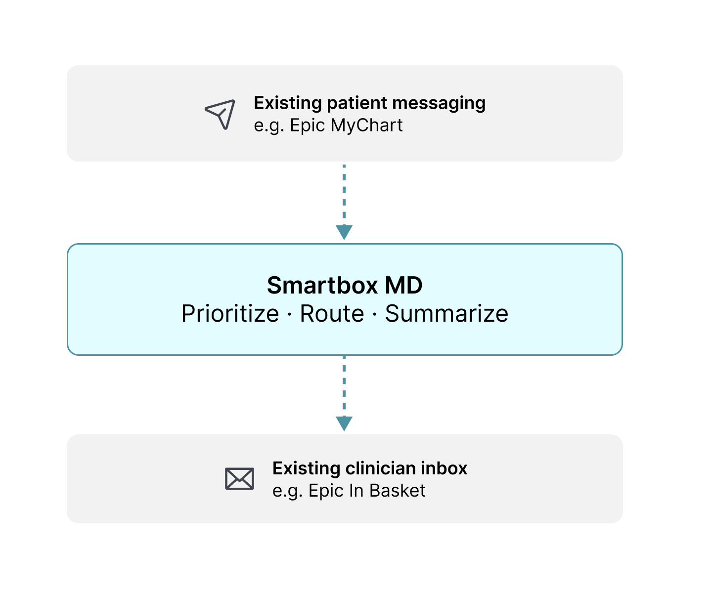
Conceptual product architecture
Strategic Design Decision 1
✅ Make the inbox easier to scan
I took the limitations of a traditional inbox and designed to pull more content to the surface. The goal was to reduce clicks needed to get an overview of incoming messages and act upon them. Giving a bird’s eye view before opening every message.
Message cards surface key context before opening a thread.
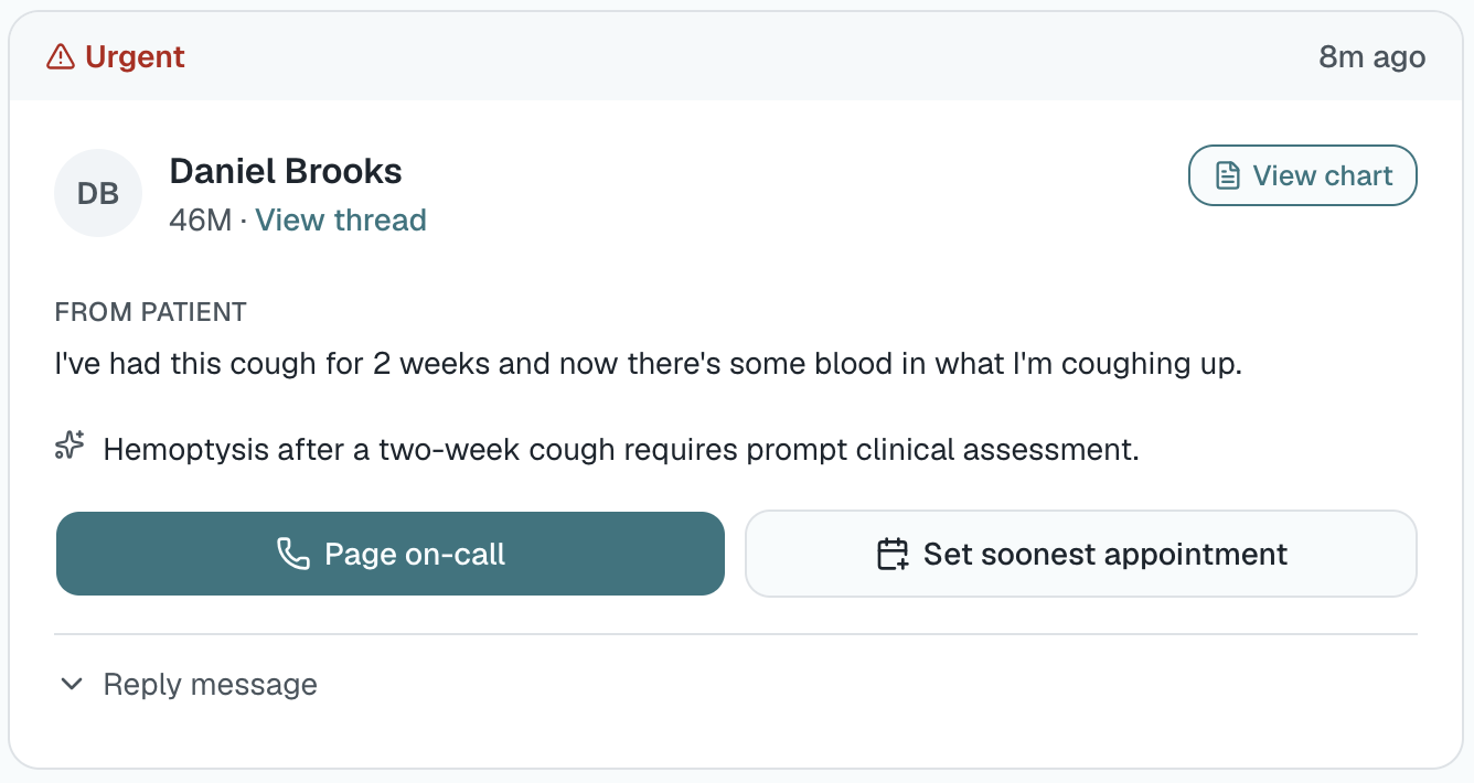
Validation gap: I wasn't able to test card hierarchy with practicing clinicians, a priority for future research.
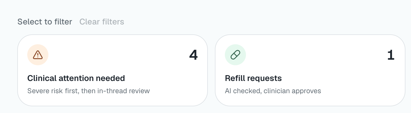
Pre-sorting the inbox with filters
Goal: Surface urgent messages and simplify decision-making.
Further Social listening
Key pattern revealed: No two workflows are the same
“Front desk staff would immediately route and notify nursing if the parent mentioned things like, high fever, lethargy, difficulty breathing...”
Strategic Design Decision 2
✅ Let clinicians shape their workflow
I couldn't find a set of categories that could represent every clinician's workflow. Which led me to understand it’s best if we do not try to decide a user’s preference.
Trying to guess in a high-stakes environment is where things can go terribly wrong.
Filter buckets created with preferences (from research)
Surfaced design principle: workflows configurable—not assumed
The final system: Smartbox MD
Configure: Clinicians set their own rules.
Choose: AI adoption can happen at a user’s comfort level.
Revert: The new inbox is optional, the original is 1 button away.
Smartbox MD puts clinicians in control of how AI works in their inbox.
in reflection
What I learned
I came into this project trying to tackle the volume problem.
The more I explored clinical inboxes, the more I saw that cognitive burden also comes from the number of decisions clinicians have to make:
what is important
what can wait
who should handle it
whether they trust the system making those recommendations
I learned that there isn't one workflow that can solve this for every clinician or organization.
That changed how I think about AI use in healthcare. The opportunity isn't just to automate tasks. It's to build systems that can adapt to the way people work while allowing them to decide how much control they want to give AI.
Next Steps: Validation
Note: The concept has not been validated with practicing clinicians.
What I’d Validate Next
Inbox information hierarchy — what clinicians actually need to see at a glance, which filters matter, and what information can be summarized.
Workflow variation — how clinicians and organizations actually triage, prioritize, and manage messages.
Routing — how routing decisions are currently made, who participates, and whether configuring those rules could become a meaningful time-saving/value proposition.