AI powered intent topics - ZoomInfo
TL;dr Redesigned Intent onboarding with AI-powered topics reducing enterprise Intent setup from hours to minutes.
Context
Admins need a fast way to set up Intent for their end users. The app had AI Recommendations that were hidden, unintuitive, and lacking onboarding features — leading to low AI rec adoption rates.
Background
As part of a multi-step roadmap, I built a flexible AI-recommended intent topics system for the new LLM data engine. The new design ensures smooth recommendation setup for enterprise admins to power their end users with personalized buying signals.
Business Goal
Milestone 1 Usability update to the Intent topic search page, allowing admin users to search by topic category across 5,000+ available topics. IA update utilizing the topic category filtering component to filter live intent topics by Offering, for admins who have set up new GTM Offerings.
Milestone 2 A complete AI recommendation system that handles 15+ scenarios from onboarding to multi-admin flows. The new Intent AI topic setup accelerates intent assignment and reduces TTV for 30k active admin users.
What I accomplished
Project Overview
Role: UX/UI Designer, User Researcher
Team makeup: Lead UX/UI Designer collaborating with PM and 5 Engineers
Duration: Feb – March 2026
Deliverables/Tasks: Requirements building, AI ideation, concept testing w/ internal Onboarding Managers, prototyping with Claude Code, Hifi in Figma
Solving Pain Points
Giving UX a POV
Intent onboarding had a problem. Admins were handed a flat list of 5,000+ topics and told to figure it out — with no guidance, no context, and a 1-month average TTV. Customer Success was spending up to 5 hours per customer through setup.
I had a short runway, a complex problem, and no clear requirements to start from. So I got scrappy.
Administrative burden
Lack of onboarding
Cognitive overload
Fragmented setup
"I don't even know where to start… there's so many topics and I don't know which ones actually matter for my business."
— Customer from study
Building from Scratch
There were no clear requirements, so I made my own.
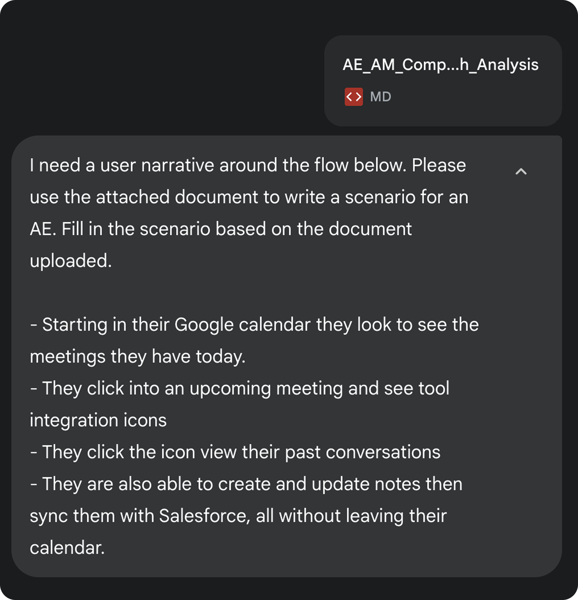
I loaded the roadmap and user research into a Claude project and used it as a strategy partner.
I started with improvements to Intent Search and My Intent (M1) Working through those smaller, more defined problems informed the bigger ideas that came later.
M2 came into focus when leadership made a strategic call: AI recommendations needed to lead the onboarding experience. The only other requirement was to support Offerings-based intent — meaning the structure had to be flexible enough to handle 50+ Offerings with intent signals attached.
Enterprise admins needed an easy route to ensure Intent was properly set up for each offering.
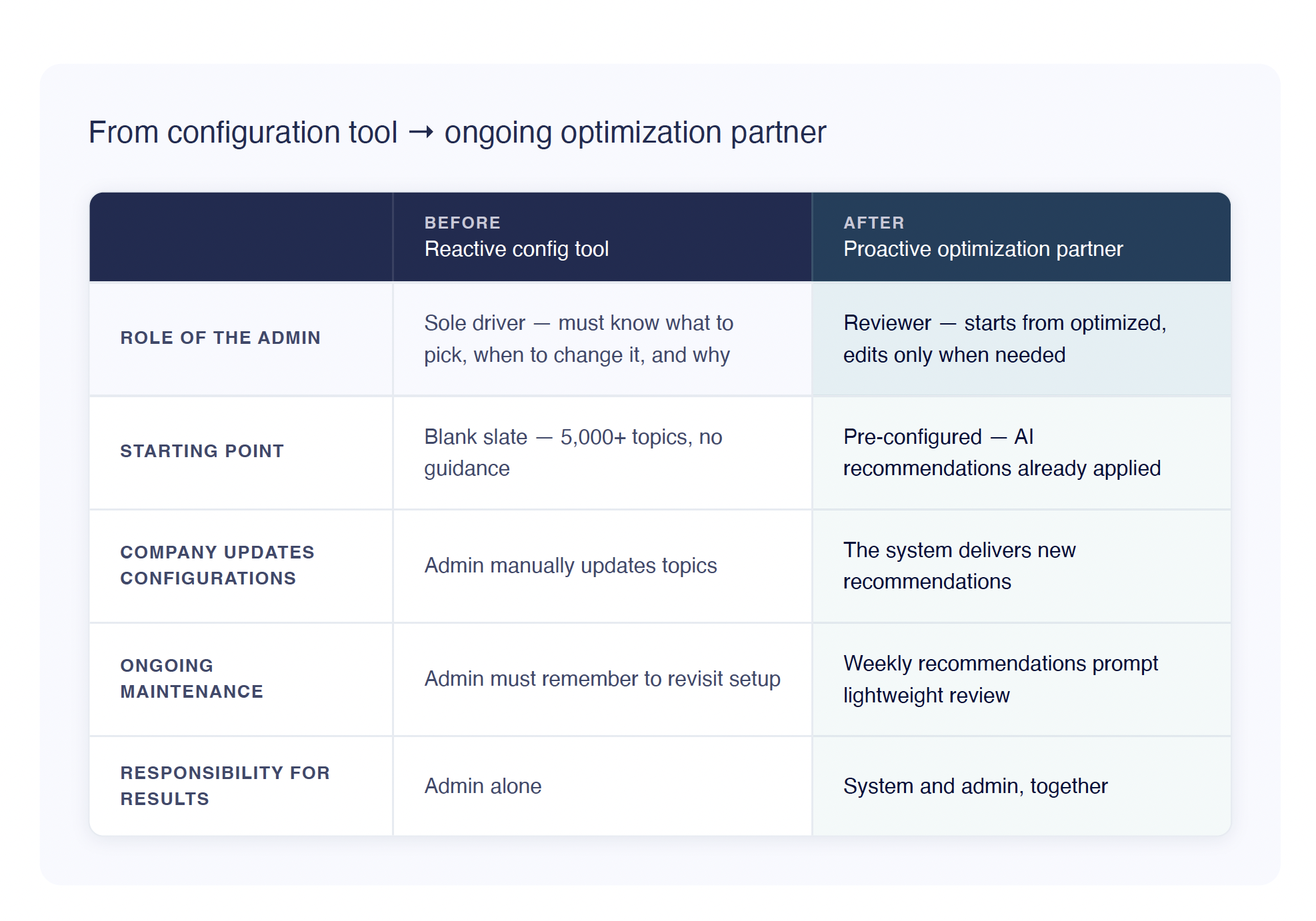
Reframing Intent's Role
The original framing treated Intent as a configuration tool. Admins had to know which topics to pick, recognize when something wasn't working, and proactively revisit their setup. Most never did.
I reframed Intent as an ongoing optimization partner, not a tool you configure once, but a system that takes responsibility for your results alongside you. That shift moved the concept from reactive (waiting for the admin to act) to proactive (the system noticing, surfacing, and nudging).
Designing a full system
Instead of tackling just onboarding, I mapped out how many scenarios would trigger possible intent topic updates for the LLM.
19 scenarios across 5 trigger categories!
Let’s start with the basics:
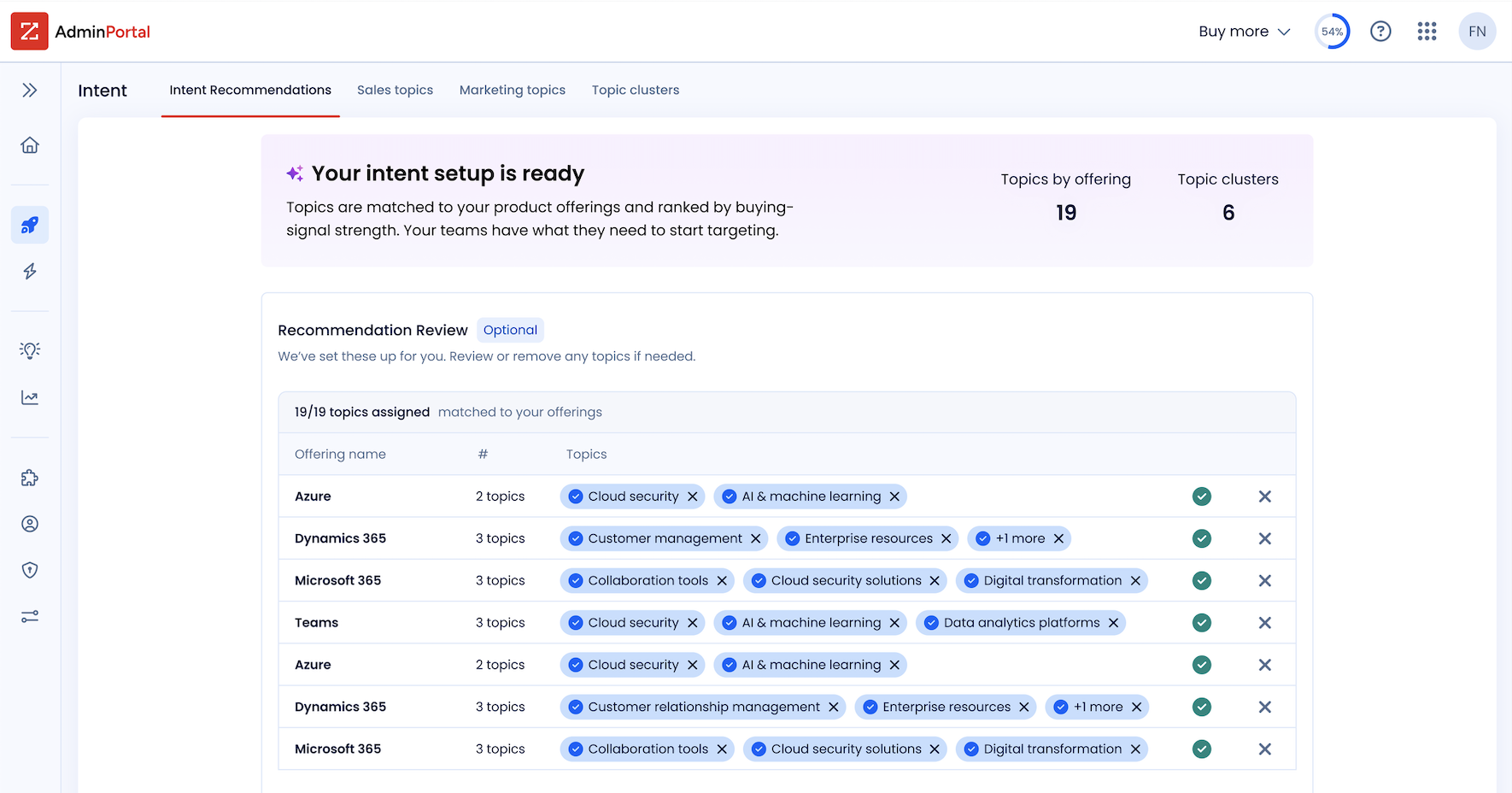
Onboarding "Your intent setup is ready." The system applies AI recommendations automatically. Admins don't start from scratch — they start from optimized. Editing is optional, not required. No blank slate anxiety.
Post-onboarding Fresh recommendations surface weekly. A lightweight, recurring touchpoint that keeps Intent current without requiring the admin to remember to check.
🖼️ **[IMAGE — Static: Two screens side by side
Let’s look at how I got there
Two Types of Topics
The PM's ask was one table for both offering-based and general intent topics. Simple enough — until I audited what columns each type actually needed.
Offering-based topics belong to a product. An admin reviewing them wants to know: *"What topics is this Offering tracking?"* Offering name leads.
General topics have a category name, not an Offering name.
Two separate tables meant more dev work, but the team was willing to make the exception. I pushed for it. Different content, different jobs. This turned out to be one of the bigger discoveries of the project and it changed the layout of the entire page.
The good news: admins only ever see one type.
Offerings configured? They get the offerings table. If not, general topics. The separation was clean and it made the advocacy easy.
🖼️ IMAGE of the two types in final UI, offering based vs general
Design V1 had a landing page with executive metrics as the first tab and nested tabs for each recommendation type. The team loved it. Then reality hit — we didn't have the bandwidth to build it. Back to the drawing board.
I tried multiple designs with feedback loops before landing on what shipped. Some leaned heavily on tabs, but a big goal was reducing time to value — so I steered away from over-relying on them.
🖼️ **[IMAGE — Static: V1 nested tab concept
V.Final: I found a way to condense the executive summary as a persistent top banner with recommendations surfaced underneath. I used a combination of vibe coding tools: Google Stitch AI concepts + Claude Code.
Usability Testing
Finding 1: Row-level activation
Usability testing revealed admins needed the ability to activate individual topic rows — not just bulk assign. I rapidly prototyped a solution and tested it with an internal expert. That also became critical when a technical hurdle put bulk assignment on hold entirely.
The user I tested with loved it immediately.
👍 Checkmarks and Xs at the row level — accept or remove a recommendation in one click. Simple. Scannable. The kind of interaction that feels obvious in hindsight but took real iteration to get to.
❌ The design it replaced buried actions in a 3-dot menu. Bringing them to the surface made the functions obvious.
🖼️ **[GIF: Row-level accept/dismiss interaction — clicking the checkmark to accept, then X to dismiss. If possible, show the old 3-dot menu first for contrast. ~6 seconds, looped.]**
Finding 2: The decision sweet spot
I had OMs rate the importance of every column shown in the current recommendations table. The answers proved we showed too much irrelevant information — making choices harder, not easier.
I reduced the columns. The new landing page shows only current and new recommendations. The older full table — all recommendations ever received — is still there for power users who want deeper metrics. The interface now serves both the light everyday user and the pro who wants advanced data.
That new landing page also made room for an Advanced Tools section — taking two long-winded, unexplained buttons off the top right of Recommendations and replacing them with contextual info about each tool before the user commits to a click. Better information before a decision. Classic UX, apparently still radical in enterprise software.
A Moment of Recognition
I was he first on my team of 30 UX Designers to use a new design pattern that helps users learn more about how to utlize the feature. This pattern is called L1, L2 internally.
I’m grateful to have pulled our Content Designer aside for a brainstorming session in the beginning of my ideation to learn about this design pattern.
The Handoff
The PM built a FE/BE flow chart covering every possible scenario — and it was a lot. I had Claude map out all user scenarios: onboarding, offering updates, errors, half-processed states. It came back as a color-coded spreadsheet. I turned that into a content support doc, the content UX team filled in the messaging, and devs got clean templates.
Figma handled the fit and polish. Claude Code helped me show the many interaction edge cases.
The final flow handles 19 scenarios across 5 trigger categories. Admins review, not rebuild.
🖼️ **[IMAGE — Static: The color-coded scenario spreadsheet. Redact anything sensitive but let the scale show. 19 scenarios across 5 trigger categories is the whole point.]**
More to Solve Than I Bargained For
Two weeks after handoff, developers flagged missed edge cases due to system complexity that hadn't been communicated earlier. I had to strategize quickly again to unblock dev.
I found myself designing rules within the system — creating logic to only interrupt the user at critical choice points.
The toughest to design for: cascading removals from offering-based topics. One topic can be recommended across multiple offerings (more than one row), and when a user removes it, we needed UX that showed where else the topic lived — and let the user decide: remove in one place, or everywhere?
A "Remember my choice" checkbox in the dialog handles it, set per session as a first assumption. I flagged that we'll need user testing or analytics to monitor behavior before making stronger decisions about that default. First assumption isn't final assumption.
Working out all the interaction kinks was tedious. But having Claude Code on hand to prototype with realistic-looking data? That was a game changer.
🖼️ **[Static or GIF: The cascading removal dialog — show the checkbox and the single-place vs. all-places removal options. Static works fine here if the interaction is complex to capture cleanly.]**
In Conclusion
This project had no clear starting line and a tight deadline. The requirements didn't exist until I built them.
Honestly, that's where I thrive. This project taught me as much about myself as it did about the product. I called the shots, moved fast, and stopped asking for permission — and that energy unlocked a version of me that is equal parts creative and strategic. Having AI tools at my fingertips didn't just speed things up, it changed how I think.
Working at a sales AI startup clearly did something to me. The passion for this problem space — helping sellers and admins actually succeed at their jobs — isn't borrowed enthusiasm. It's mine.
I care deeply about making enterprise software that's easy on the eyes, intuitive, and makes people feel supported instead of overwhelmed. That's the designer I am.
Sometimes these settings-type pages feel like an afterthought — but I built it like it matters. Because it does.