
Design and Service Strategy
As part of the Design Fwd Resiliency challenge, we designed a service plan and solution package to help a local culinary goods store leverage their existing following to increase profits during the pandemic. This project was grant-funded by the state of Rhode Island. Here’s the story.
More about Stock Culinary Goods
Stock is a brick-and-mortar store selling unique culinary supplies and local foodie favorites in Providence, RI. This 12 yr old storefront is situated in the middle of Providence’s thriving culinary scene. The owner Jan is an energetic supporter of the community.
Project Overview
UX/UI Designer (on a team of 4). Restaurant Operations Manager, Architect, and Industrial Designer. Team Lead: Senior UX Designer
Contributions: User Research, Secondary Research, Service Plan, Mid-Fi Prototyping, Product Brainstorm.
Tools: Mural, Figma, Google Docs & Sheets.
Duration: 4-Week Sprint
Our Process
Brief
Project Goal
Help Stock Culinary Goods reimagine their connection to the community as they continue to alter their business model due to Covid-19.
DISCOVER: User RESEARCH
I interviewed 3 shoppers
We learned about how they send thanks, and what their social media habits are:
Have you expressed gratitude to frontline health workers?
If yes, how did you express appreciation?
What social platforms do you use most frequently?
Then we got a little deeper..
Describe a time when a healthcare worker helped you.
(Results showed most users can think of a specific interaction they were grateful for.)
If you could thank that person, what would you tell them?
“I have thanked them for their committed service to help everyone in need. I thanked them for showing compassion and selflessness to the community.”
Discover
Health care workers are experiencing…

Only 35% feel they have adequate emotional support.
😢Source: https://mhanational.org/mental-health-healthcare-workers-covid-19
Define
The Problem
Frontline health workers are experiencing unprecedented hardship from Covid-19.
How might we support them and show gratitude?
The Solution
A web app for frontline medical workers to receive appreciation for their work through a digital wall of 'thank you’ notes.
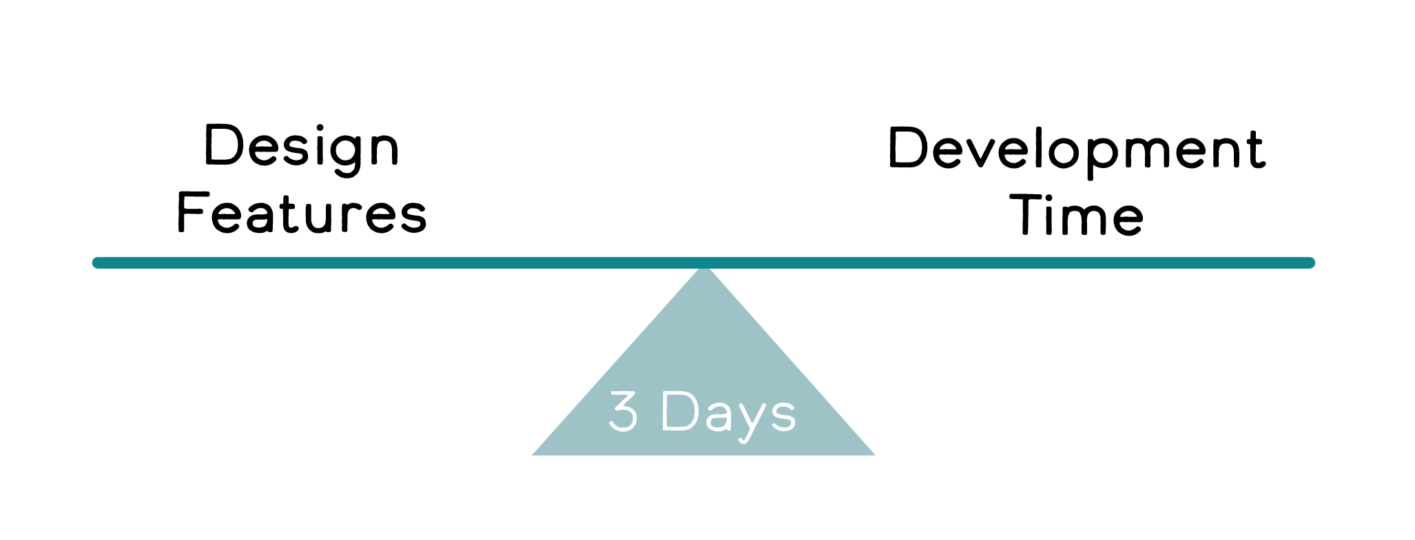
Designing realistically to Develop
With only 3 days, we worked closely with the engineers to plan efficiently within the short time frame. We identified must-haves vs stretch goals.
The devs started with CRUD, and Designers dove into branding, user surveys, and wireframes.
Define
The MVP
Key features:
Public to view the feed, sign up to post
Posting
Optional to be anonymous
Tag city & hospital
Responsive design
Minimalist profile page
View # of posts
Edit/delete posts
V2
Stretch Goals:
Posting
Emoji keyboard + Color Picker
UI Feedback after posting
Post Reactions (liking of other posts in feed)
ideate
Design System and Product Name
A simple name was needed, and it took a lot of brainstorming to get there. For the color palette, we focused on friendly shades of teal to mimmick hospital scrubs.

Responsive UI
Based on Material UI grid systems
Looked at 3 screen sizes (S, M, L)
Focused on clean design with easy to use simple MVP features.
TEST
3 Usability Testing Results
Key Findings:
2 users found creating a post button hard to find
We learned to be consistent with our wording; “message” or “post” or “thanks”
The use of a hero message gave users context
All users wanted to be able to add emojis, and change color and fonts.
Iterate
High Fidelity Changes
Based on testing we made a few slight changes.
What I learned
Making sacrifices to the scope early on helped us keep on track for development.
There are no stupid questions. Designers can only learn what is easy or hard to code if we ask; it’s a continuous effort I make as a Designer.
Communicate with Devs early and often. Even the quick check-ins I made for them to show me their work helped identify design errors and correct responsive behavior. We moved forward efficiently with all questions answered.

